Race Analysis Made Easy with 10 Clear Visuals
Race Analysis Made Easy with 10 Clear Visuals
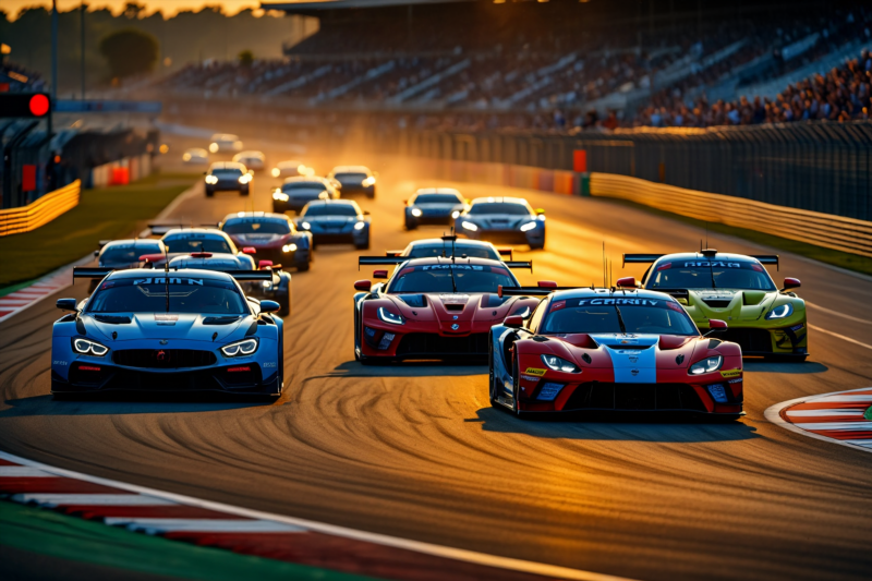
Understanding motorsport performance can seem overwhelming—complex data, fast-paced action, and countless variables. But what if you could simplify this complexity through engaging visuals that unlock the secrets behind race results? At RaceRhythm, we believe in transforming intricate racing data into accessible, actionable insights. In this article, we will guide you through breaking down a race using 10 easy-to-understand visuals, enabling fans, analysts, and team strategists alike to grasp performance trends, analyze driver behavior, and refine strategies effectively.
Why Visuals Are Essential in Race Analysis
Visuals serve as bridges between raw data and strategic understanding. They help to:
- Identify Patterns and Trends: Spot performance shifts over laps or sectors.
- Compare Drivers and Teams: See who performs consistently or premiums at specific moments.
- Diagnose Race Dynamics: Understand tire degradation, fuel strategy impacts, or driver aggression.
- Make Data-Driven Decisions: Use insights to optimize future strategies.
The 10 Key Visuals to Break Down a Race
Below is an overview of the most impactful visuals used in comprehensive race analysis. Each visual focuses on a different aspect of performance, forming a complete picture when combined.
| Visual Number | Name | Focus Area | Benefits |
| 1 | Race Timeline Heatmap | Overall race progress | Visualizes lap-by-lap performance and critical moments |
| 2 | Sector Speed Charts | Sector consistency and speed | Highlights which parts of the track drivers excel or struggle in |
| 3 | Tire Degradation Graph | Tire wear over laps | Shows how tire performance impacts lap times |
| 4 | Fuel Strategy Profile | Fuel consumption and laps remaining | Correlates pit stops and race pace with fuel management |
| 5 | Driver Lap Time Distribution | Variability in lap times | Identifies consistency vs. aggressive pace shifts |
| 6 | Race Position Over Time | Position changes during race | Tracks overtaking and defensive moves |
| 7 | Predicted vs. Actual Performance | Strategy execution vs. plan | Reveals execution efficiency and surprises |
| 8 | Pit Stop Effectiveness Chart | Impact of pit stops | Measures how pit strategies influence overall race results |
| 9 | Car Development & Setup Impact | Setup variations | Associates setup choices with performance changes |
| 10 | Realtime Performance Overlay | Live data during race | Provides immediate insights for tactical adjustments |
How These Visuals Inform Better Race Strategies
Analyzing these visuals enables you to answer critical questions:
- Where did a driver lose or gain time? (Race Timeline Heatmap, Sector Speed Charts)
- How effective was the tire strategy? (Tire Degradation Graph, Pit Stop Effectiveness Chart)
- Did the tire or fuel strategy influence overtakes? (Fuel Strategy Profile, Race Position Over Time)
- Are drivers maintaining consistent lap times? (Driver Lap Time Distribution)
- How did external variables like weather or track conditions impact performance? (Overlay with environmental data)
By interpreting these visual insights, teams and fans can identify opportunities, diagnose issues, and refine tactics for upcoming races.
Expert Tips for Effective Race Data Interpretation
- Contextualize Data: Always consider race conditions, such as safety cars or weather, when analyzing visuals.
- Combine Multiple Visuals: Cross-reference visuals—for instance, check tire wear against lap times to see impact.
- Focus on Consistency and Anomalies: Spot irregularities that might suggest driver errors or mechanical issues.
- Track Trends Over Multiple Races: Use comparative visuals to observe performance evolution.
Frequently Asked Questions
Q: How can these visuals help casual fans better understand racing? *A: They simplify complex data, making it easier to follow driver performance, race dynamics, and strategy success, enhancing the overall viewing experience.*
Q: Are these visuals useful for team strategy development? *A: Absolutely. They provide actionable insights on tire management, pit timing, driver performance, and car setup, crucial for making informed tactical decisions.*
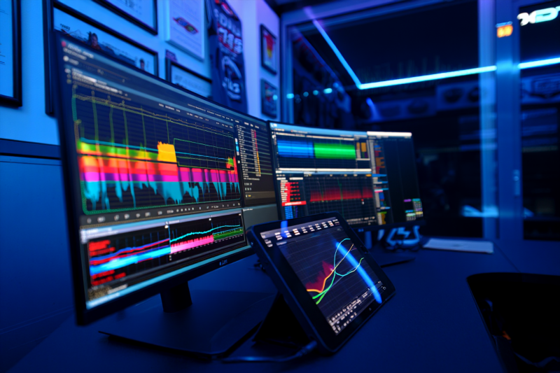
Q: What tools are best for creating these visuals? *A: Advanced data visualization platforms like Tableau, Power BI, and specialized motorsport analytics software are ideal, often integrated with telemetry data systems.*
At RaceRhythm, our mission is to make high-performance motorsport analytics accessible and impactful. By leveraging these 10 clear visuals, anyone—from fans to professionals—can decode the complexities of racing, uncover performance patterns, and enhance strategic decision-making. The next race you analyze, use these insights to see beyond the surface and unlock the true story behind every lap.
*Ready to elevate your race analysis? Explore our platform for real-time data, expert insights, and custom visual dashboards designed to put you in the driver’s seat of performance understanding.*